

Choosing the Right Color for the Mother of the Bride: A January Guide
A clear framework for making the decision without second-guessing yourself.
January is when this decision stops being abstract.
The wedding date is set.
The venue is booked.
Photos feel real now.
Color becomes the question that won’t go away. Everyone has an opinion. None of them agree. What looks elegant to one person feels wrong to another. That tension is normal.
The goal is not to follow a trend.
The goal is to feel certain.
Here is the framework we use to help mothers make this decision calmly and with confidence.
The five variables that matter most
While this guide is written with mothers of the bride in mind, the same principles apply to mothers of the groom and often with even more importance placed on subtlety and coordination.
Most color confusion comes from ignoring context. These five factors do more work than any Pinterest board.
Time of day
Evening weddings support deeper tones. Daytime weddings reward lighter ones. This alone eliminates half the wrong choices.
Season
Winter and early spring can handle richness. Late spring and summer need air and lightness.
Venue
Ballrooms absorb color. Gardens reflect it. A dress that looks perfect indoors can feel heavy outdoors.
Your role
Mother of the bride and mother of the groom carry different visual expectations. One often anchors. The other supports.
Your personal coloring
Hair, skin tone, and contrast matter. A “safe” color can still drain you if it fights your natural palette.
If one of these is unclear, the color decision will feel shaky. That is not a personal failure. It is a missing input.
Color guidance by real situations
Rather than lists, think in scenarios.
Formal evening weddings
Navy and deep blue are reliable here. They photograph beautifully and carry authority without pulling focus. This is why navy dresses for mothers remain our most requested option.
Daytime or spring weddings
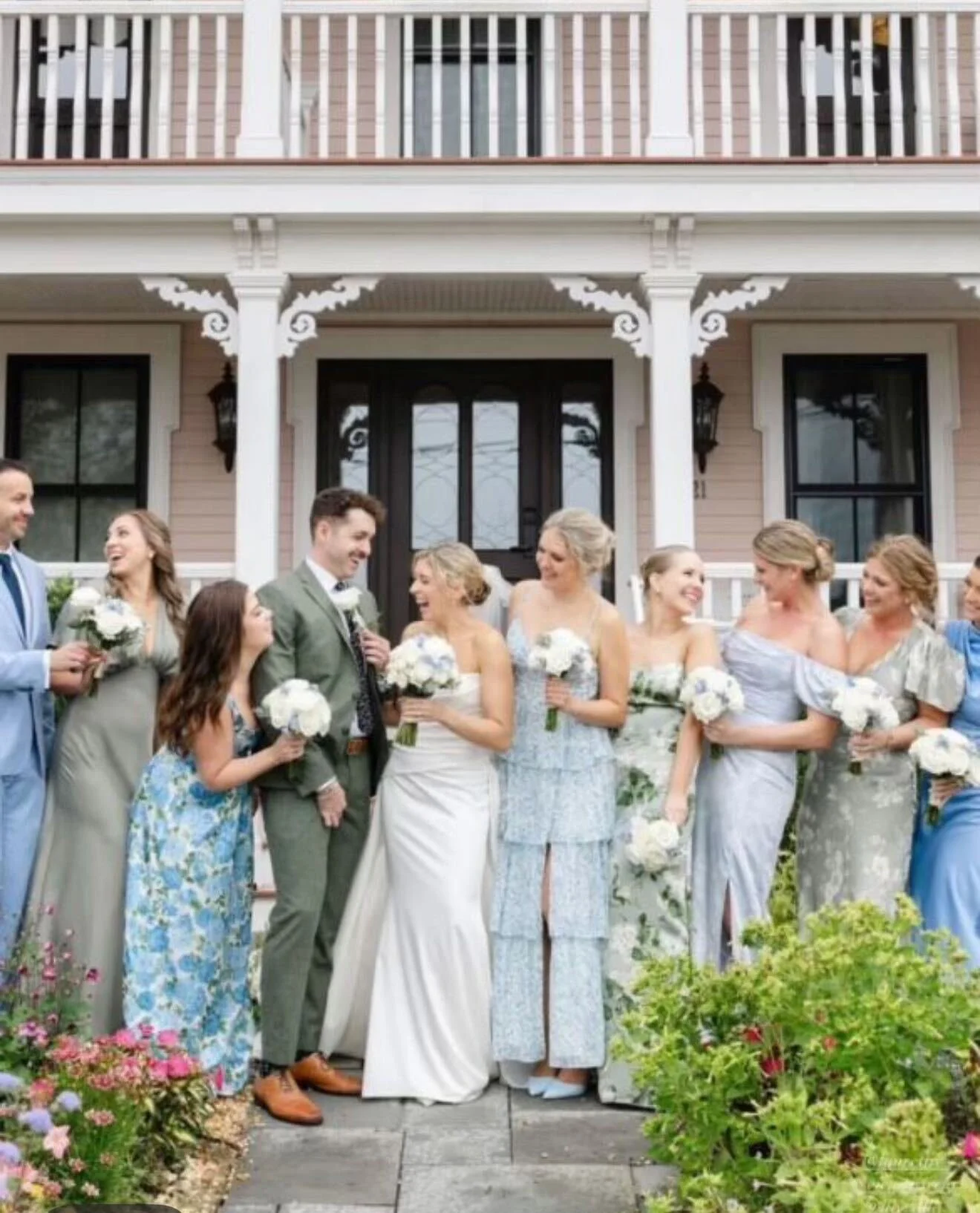
Softer blues and greens feel appropriate and relaxed. They work especially well for outdoor venues and earlier ceremonies. When chosen correctly, they read intentional, not casual. Our guide to blue for the mother of the bride and our green dress overview cover these nuances in detail.
Symbolic or culturally significant weddings
Gold appears often for a reason. It signals celebration, continuity, and respect. When done with restraint, it feels elevated rather than theatrical. We explain this more fully in our article on why gold is worn at weddings.
Confident but traditional statements
Red and burgundy belong here. They require discipline in fabric and cut, but when executed well, they project confidence without competition. Our mother of the bride red dress guide and burgundy overview address when these colors work and when they do not.
The mistake is choosing a color first and hoping the context catches up. Reverse that order.
Common mistakes we see
These are the patterns that lead to regret.
Choosing a color because others expect it.
Matching instead of complementing the wedding palette.
Ignoring fabric weight and finish.
Letting trends override the setting.
Showing up in a saturated or primary color when the wedding palette is soft and pastel.
Pastel environments amplify contrast. A strong primary can unintentionally dominate photos, even when the intention is celebratory.
Color is rarely the real issue. Clarity is.
A final note
Most women who struggle with this decision are not indecisive. They are conscientious. They understand the moment matters.
That is why our process always begins with conversation before sketches or fabric. Once the context is clear, the color usually becomes obvious.
Certainty follows clarity.