

Why We Rarely Dress Mothers of the Bride in Red
and the Conditions Under Which We Will
Red is not inappropriate by default.
It is inappropriate by misuse.
For mothers of the bride, red is a color we almost always decline. Not because it lacks beauty, but because it leaves very little margin for error. It advances visually. It photographs first. And without careful control, it can quietly pull focus from where it belongs.
At a wedding, that balance matters.
A mother’s role is not to disappear, but neither is it to compete. She anchors the emotional tone of the day. Her presence should feel assured, steady, and correct. Red, when chosen casually, often works against that goal.
This is why restraint matters more than preference.
Red behaves differently depending on context. In daylight it can harden. In candlelight it can feel theatrical. In photographs it often reads louder than it felt in the room. These effects are magnified by setting, movement, and proximity to others.
That is why red, when it works, must be held in balance by everything around it.
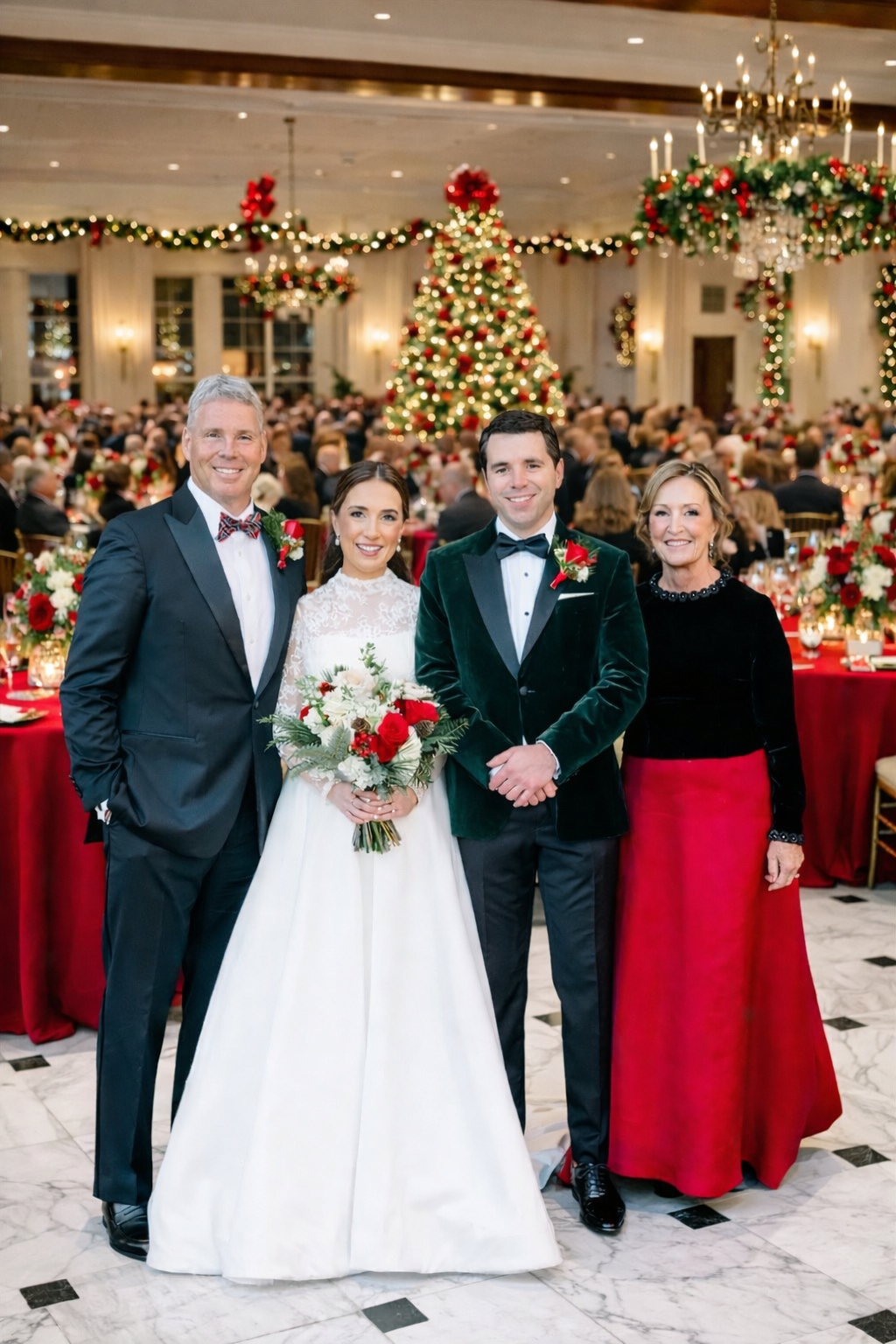
In this instance, the setting did much of the work. An intimate interior. Evening light. A festive, formal environment that could absorb richness rather than amplify it. Within that context, red read as warmth, not assertion.
The gown itself was structured to support that restraint.
The bodice was black velvet. Velvet absorbs light. It steadies the eye. It brings gravity. Against the skin, it reads composed rather than decorative. The skirt, by contrast, was red silk—chosen for weight and movement rather than sheen. It moved softly and settled quickly. The red did not lead the room.
Proportion completed the equation. Clean lines. No excess. Nothing competing for attention.
Presence, not performance
Weddings are not static. They unfold through moments—procession, pauses, conversation, movement. A gown that works only when standing still is not doing its job.
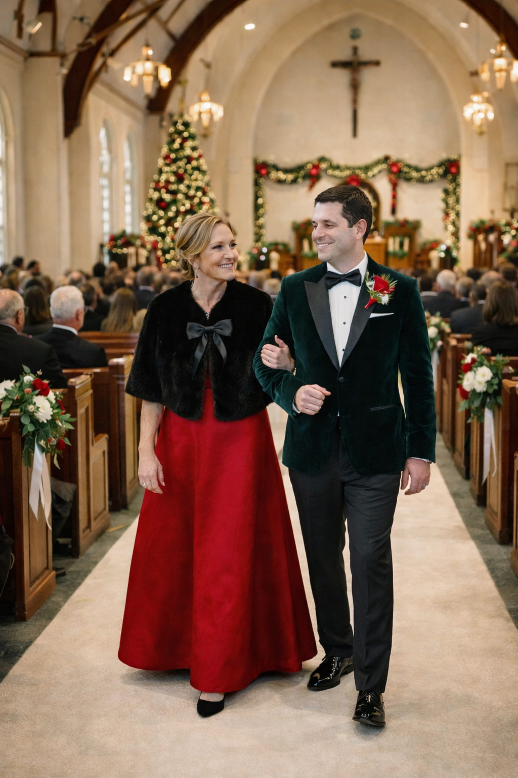
As the day moved into ceremony, the addition of a cropped black fur stole further anchored the look. It softened contrast. It framed the bodice. It ensured the red remained secondary during one of the most visible moments of the day.
This is not decoration.
This is control.
Color at a wedding must respond to context. What works at dinner may not work in procession. Adjustments like this are not afterthoughts—they are part of the discipline.
The true test: movement
The final measure of any choice is how it behaves once the evening is fully underway.
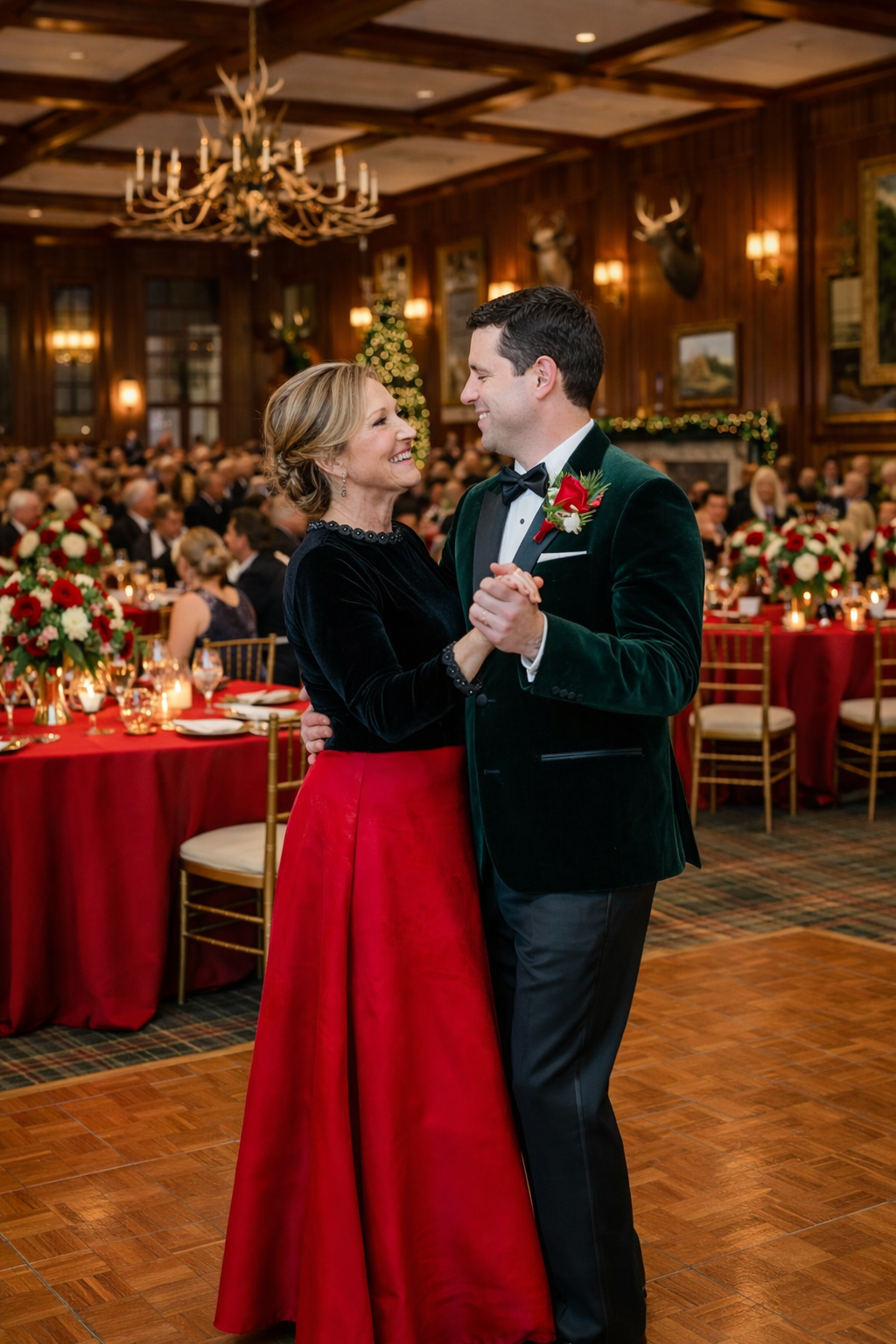
In motion, the gown remained calm. The red followed rather than announced. The black held the center. Nothing pulled focus. Nothing felt performative. The result was presence without dominance.
This is the difference between wearing a color and understanding it.
Why we are so selective
Rules in dressing exist to protect women from regret—from photographs that age poorly, from moments that feel misjudged in hindsight. Most of our work is quiet. It is about knowing when to say no early so that the final outcome feels effortless.
When we do make an exception, it is because the conditions are right:
the setting, the structure, the materials, the proportion, and the moment.
Red is not forbidden.
It is unforgiving.
Handled without discipline, it overwhelms.
Handled with care, it can be deeply elegant.
Taste is not about boldness.
It is about knowing when restraint carries further.