

Gold, Navy, or Light Blue? Choosing the Right Color for a Mother of the Bride Dress
Color is rarely the problem.
Tone is.
Most regret does not come from silhouette. It comes from choosing a color that collapses under lighting, competes with the bridal palette, or ages the wearer unintentionally.
When a woman searches for gold mother of the bride dresses or navy blue mother of the bride dresses, she is not browsing. She is narrowing. She is close to a decision.
Here is how to choose correctly.
Gold Mother of the Bride Dresses
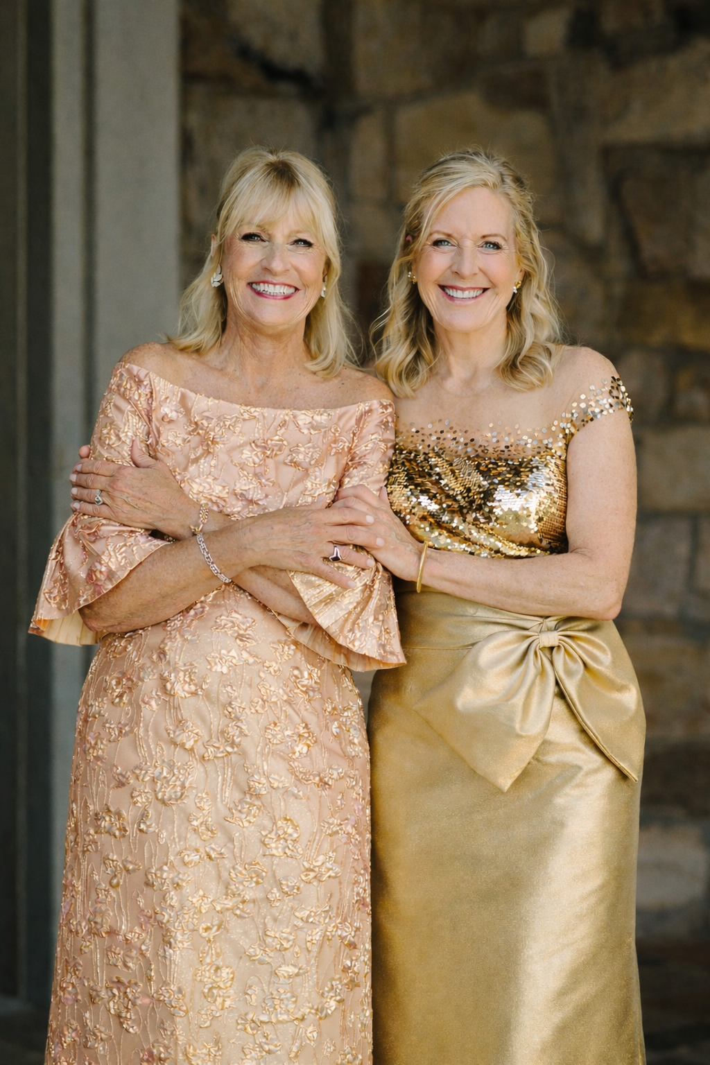
Gold is powerful. It can read regal or theatrical depending on fabric and structure.
Soft antique gold in silk jacquard behaves differently than high-shine synthetic satin. Under evening lighting, real silk absorbs and reflects in layers. Polyester flashes.
Gold works best when:
The wedding palette is neutral or deep-toned.
The event is evening or black-tie.
Structure is clean and architectural.
Gold fails when:
The tone is too yellow.
The fabric is thin.
The silhouette lacks restraint.
A bespoke gold mother of the bride dress allows tone testing in natural and artificial light before final fabrication. That alone eliminates most mistakes.
Navy Blue Mother of the Bride Dresses
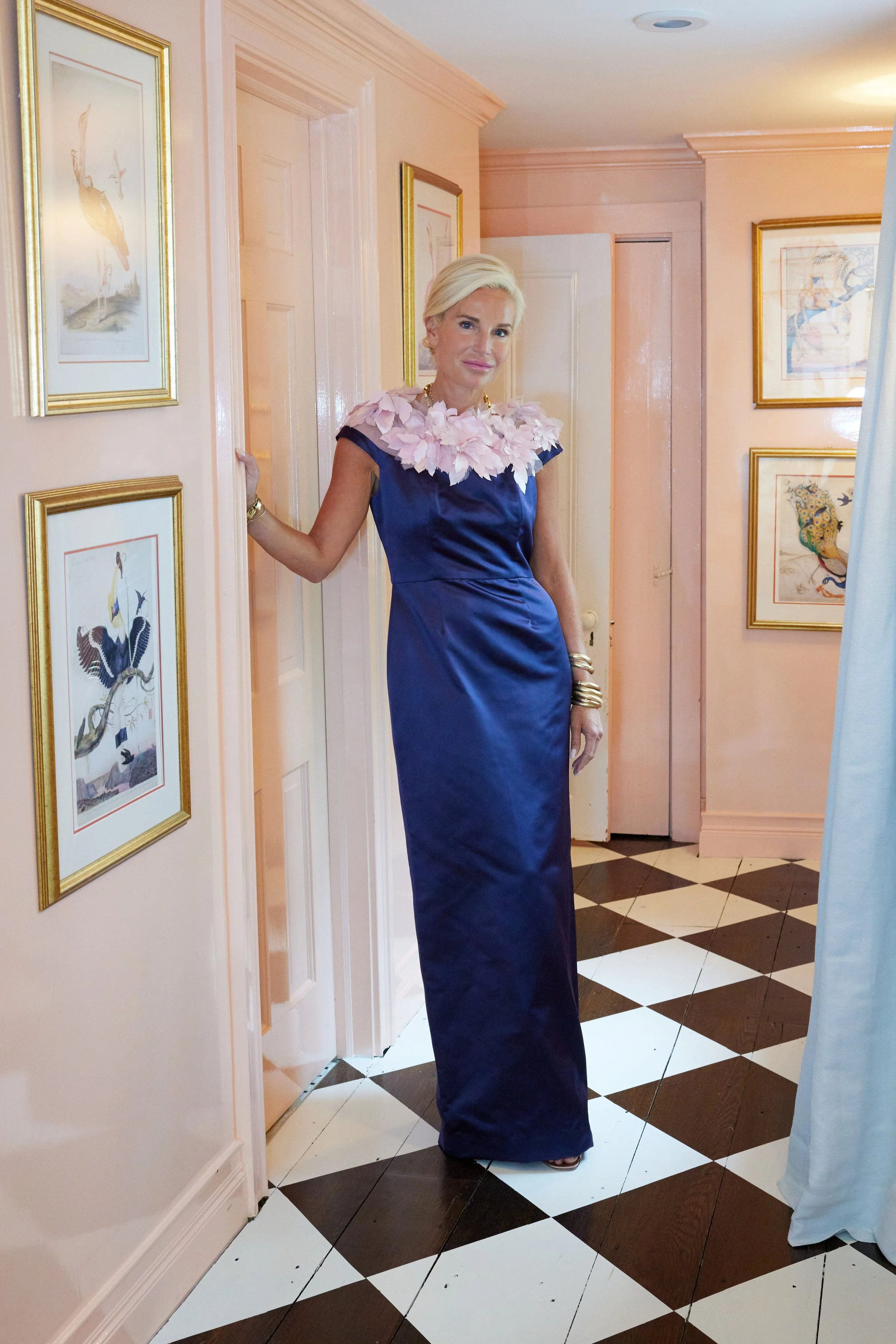
Navy is considered safe. It is not.
Navy can look commanding or corporate. The difference is construction.
In structured silk faille or mikado, navy reads formal and decisive. In thin stretch fabric, it reads utilitarian.
Navy works well when:
The event is formal.
The bride’s palette includes cool neutrals.
The wearer wants presence without brightness.
Sleeves matter here. Navy with strong sleeve architecture reads couture. Sleeveless navy in the wrong fabric reads department store.
A bespoke navy blue mother of the bride dress ensures proportion is deliberate, not accidental.
Light Blue Mother of the Bride Dresses
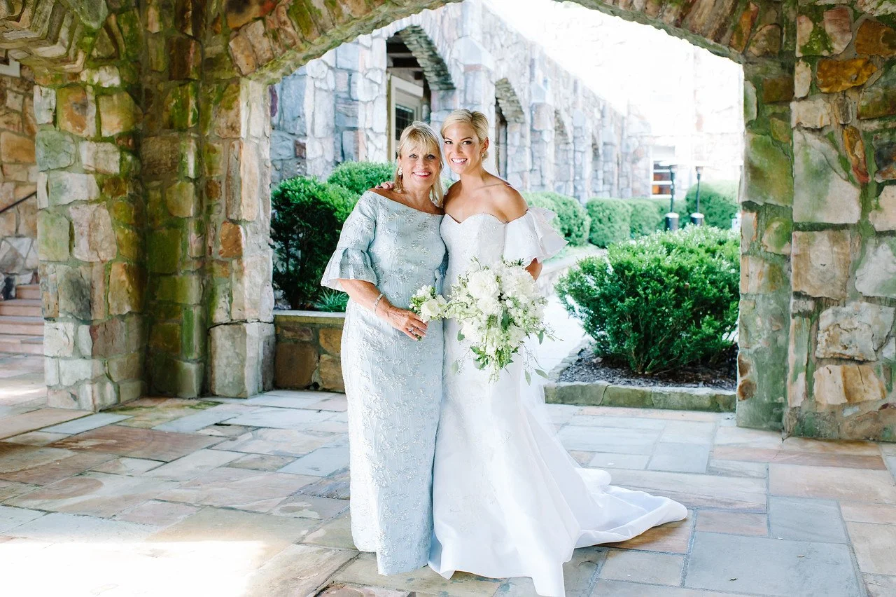
Light blue is soft. But softness disappears in flash photography if tone is wrong.
Pale powder blue can look luminous in daylight and washed out indoors. Slightly deeper sky or French blue often photographs better.
Light blue works best when:
The wedding is spring or coastal.
The bride’s palette includes whites and pale neutrals.
Fabric has body and subtle sheen.
Texture becomes critical. Light blue in silk with structure holds posture. In lightweight synthetic, it collapses.
Precision in shade selection is the difference between elegance and invisibility.
Floral Mother of the Bride Dresses
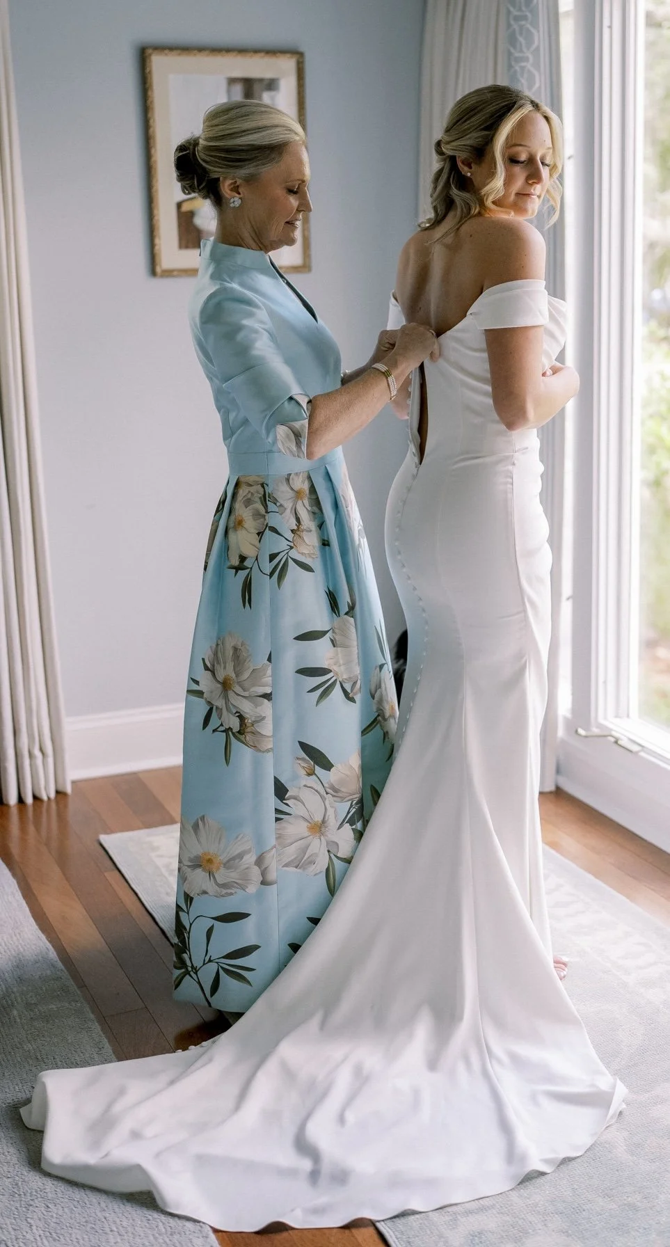
Floral is riskier than solid color.
Scale matters. Large florals overpower petite frames. Small florals can look casual if not structured properly.
Background color matters more than print. A navy-ground floral reads formal. A white-ground floral often reads daytime.
Floral works when:
The pattern scale aligns with the wearer’s proportions.
The silhouette is structured.
The print placement is intentional.
In bespoke, placement is controlled. That changes everything.
When Color Should Be Decided Bespoke
Color is not chosen in isolation.
It is chosen with:
Lighting in mind.
Fabric weight in mind.
Body tone in mind.
Venue in mind.
Photography in mind.
Off-the-rack forces compromise. Bespoke eliminates it.
If you are considering gold, navy, light blue, or floral for your event, explore what structured, proportioned construction does to color presence.
Explore our bespoke mother of the bride collection to see how color behaves when built intentionally.