

Is Blue the Most Classic Color for a Mother of the Bride Dress?

Many mothers begin their dress search with a simple question. What color feels right for the wedding day? The options are endless. The palettes shift from season to season. But blue never moves. It stays steady. It carries a quiet confidence. It works in almost every setting. You can trust it.
Why Blue Endures
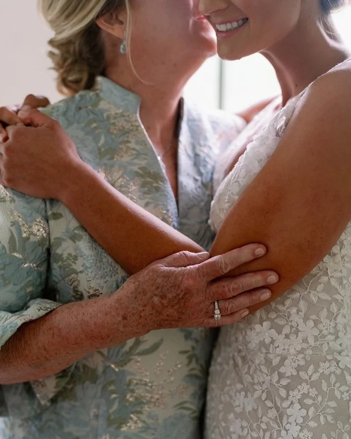
Blue has a long history in weddings. It carries a sense of calm. It signals trust and composure. It sits beside white without competing. It blends with ivory, champagne, gold, green, black, and soft pastels. It supports the room instead of leading it. That is part of its strength. When you choose blue, you choose ease.
The most appealing part of blue is how it behaves on camera. Weddings are photographed from every angle. Morning light. Afternoon shade. Indoor ceremony. Evening reception. Blue stays balanced through all of it. It shapes the body well. It flatters the skin. It avoids the common mistakes of lighter colors that can wash out, or bright colors that can feel sharp in group photographs. Blue gives you presence without pulling attention away from the bride.
There is also something timeless about seeing a mother in blue. It feels natural. It feels appropriate. It carries the same stability you find in navy suiting or evening wear. You know what you are getting. You know it won’t feel dated when you look at the photos years later. That is part of why mothers reach for it. They want to feel confident today and comfortable with the memory later.
Blue also gives room for interpretation. Navy feels formal. Slate feels modern. Powder blue feels gentle. Cobalt feels lively. These shades let you express your personality within a color that still reads classic. A woman who wants structure can choose a darker tone with a clean line. A woman who wants softness can choose a lighter tone with movement. Blue holds all of these moods without losing its identity. If you want to see how cobalt comes to life in a real setting, you can explore one of our BB cobalt designs here.
Fabric plays a role too. Satin blue feels ceremonial. Crepe feels refined. Jacquard feels rich. Chiffon feels airy. The same color changes character depending on the fabric. A navy crepe column dress reads differently than a navy satin gown. A pale blue chiffon dress belongs in a garden wedding. A slate blue jacquard belongs inside a ballroom. Blue adapts without losing its core message.
Venue and season add more dimension. Spring and summer weddings welcome lighter blues. Garden settings, coastal settings, and outdoor ceremonies all support pale tones and soft movement. Fall and winter invite navy, midnight, and slate. They bring weight and structure that look right in cooler light. Blue shifts with the environment. It never fights it.
There is also an emotional side to this choice. Many mothers want a dress that shows care without drawing attention. They want to feel beautiful. They also want to stay in harmony with the bride and the overall vision of the day. Blue allows this balance. It signals grace. It communicates consideration. It lets the mother appear in the photographs with quiet strength. That is often exactly what families want to see.
The Three Decisions
When mothers ask us for guidance, we help them make three decisions. Shade. Texture. Mood. Shade sets the tone. Texture shapes the form. Mood tells the story. These three elements create clarity. Once those choices fall into place, the dress finds its shape. If you want to explore the nuances of blue in more detail, you can read our earlier guide here.
For deeper exploration of shades and fabrics, our earlier article on blue offers detail and examples. It helps mothers break down the differences between navy, royal, slate, and pastel, and shows how each works with different settings.
Another reason blue endures is practicality. Most mothers already know they look good in it. They wear navy in their daily lives. They choose blue for evening events. They rely on it the way men rely on navy suiting. When the wedding day approaches, the familiarity becomes a strength. They feel like themselves. They look like themselves. They step into the photographs without discomfort.
Does this mean blue is the only option? No. Some mothers want another note. Some love the light and romance of pink. Some prefer champagne or green. But when the question is about the most classic color, blue stands at the top. It is the safe choice in the best sense of the word. Safe because it works. Safe because it flatters. Safe because it holds up in memory.
If you are beginning your search, consider blue early. Hold the shades next to your event palette. Think about the venue. Think about the season. Think about how you want to appear in the photographs. The right blue will feel natural. It will feel aligned with the day. It will give you calm in a room filled with emotion.

If you want to explore blue in a structured way, visit the Calabro Collection. You will see how blue moves across fabrics and forms. Each dress begins as a pattern created specifically for one woman. That precision gives confidence. That confidence reads clearly in the photographs that families keep.
Blue remains the classic choice for a reason. It has earned its place. And for many mothers, it becomes the color that carries them through one of the most meaningful days of their lives.
If you’d like to hear from mothers who have worked with us, you can read their reflections here.